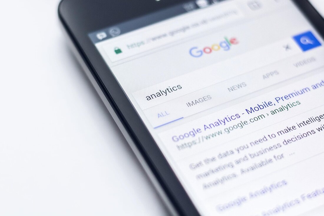
Google surprises with a new logo: Color gradient delights users!
Google updated its iconic 'G' logo with a modern gradient on May 12, 2025 to emphasize its focus on AI.

Google surprises with a new logo: Color gradient delights users!
On May 12, 2025, after ten years, Google unveiled an updated “G” logo that replaces the previous hard color blocks with a soft gradient. This visual change comes in the context of a purist design and reflects the company's increasing focus on artificial intelligence. Loud City Magazine The colors blue, red, yellow and green are now seamlessly connected to each other.
The shape of the letter remains the same, but the new aesthetic conveys a softer, more dynamic and modern appearance. This visual redesign is closely linked to Google's identity, which is increasingly focused on AI-powered products. In particular, the design of the AI assistant Gemini, which already uses color gradients, influenced the creation of the new logo, like The Bridge Chronicle reported.
Introduction and visibility
The new logo is currently visible in the Google Search app on both iOS and Pixel devices. Android users can observe the change in beta version 16.18 of the Google app. However, the old logo remains in other Google services such as Gmail, Chrome and Maps. However, a gradual introduction of the new design in further applications is expected.
The decision to update the logo is the first major change since 2015, when Google moved to a modern, sans serif typeface and color-blocked “G” icon. The dynamic gradient is part of a broader trend toward a more consistent visual identity and intended to help Google move toward a tech-driven future.
Brand consistency and future outlook
Experts believe we could see further design feedback and possibly similar changes to other Google products to ensure brand consistency. The new logo is perceived as more colorful and vibrant and adapts well to current digital design trends.
In summary, Google's new "G" logo not only presents a fresh, modern look, but also demonstrates the company's shift towards a more innovative and AI-centric approach.

 Suche
Suche
 Mein Konto